Mid-Century Modern
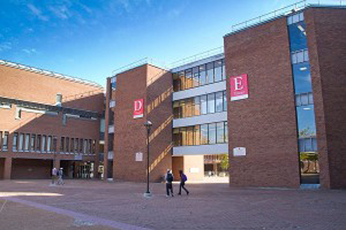
My art education was at the St. Louis Community College campus at Forest Park. This spare and efficient urban campus, designed by prominent mid-century architect Edward Durell Stone, rose from the ashes of the Forest Park Highlands amusement park. Literally. The popular attraction burned down in the summer of 1963 and the campus opened in 1970.
It was my second educational experience inside a fine example of mid-century modern. The first was from 5th through 8th grade at the brand new St. John the Baptist grade school.
Everything about the “new school” was clean and fresh. Our older school building had that soul-sucking reform school vibe; green institutional walls, dreary, hook festooned cloak rooms, dull yellow incandescent lights dangling from high, cavernous ceilings.
The new building was bathed in light, with lower white ceilings, spacious windows, pastel walls, and modern green “black boards” (oxymoron acknowledged), facing rows of streamlined blonde formica desks. The scratch free slim desks replaced the ancient oak and wrought iron versions, with their hinged lid/desk top bored with holes for ink bottles. Perhaps Bob Cratchit went to the older St. John’s grade school. Elroy Jetson would feel at home in the new St. John’s.
The new building wasn’t quite yet The Jetsons, it didn’t hover in orbit, but it was far removed from Oliver Twist. It helped nurture my preference for clean lines and sparse beauty. I also live in a city where mid-century modern sits side by side with 19th century Beaux Art, Second Empire French, Arts and Crafts bungalows and assorted Old World motifs.
McDonnell Planetarium
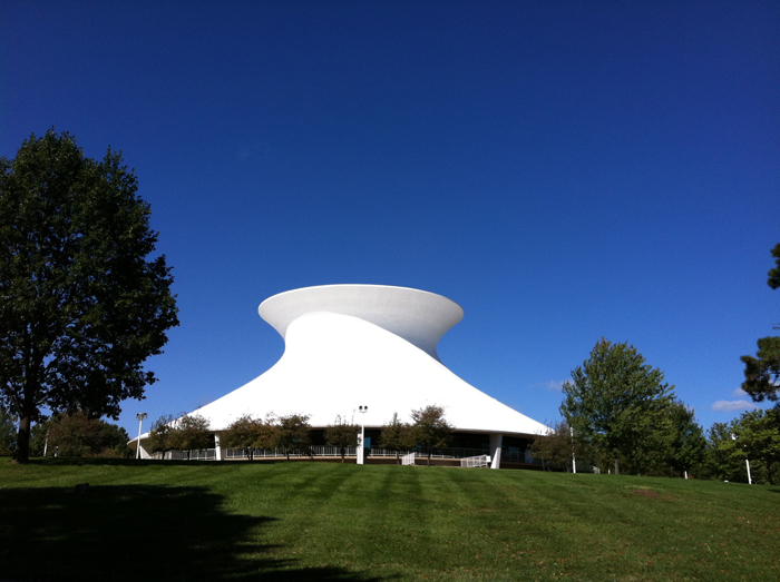
While a student at Forest Park, I was offered a financial aid opportunity to work as an artist for the McDonnell Planetarium. That’s the building shown at the top of this post. This was an exciting time for me as a budding artist and architectural enthusiast. I was a Fine Art student, so this job introduced me to the commercial art field. It also introduced me to the inner life of this gorgeous building. I used to scale the ladders inside the dome (forbidden area to the public) and sit on the outside rim at the top of the structure.
Designed by Gyo Obata, of Helmuth, Obata, and Kassebaum (HOK), the Planetarium opened in 1962. If my new grade school didn’t quite rise to Jetson level, this structure exceeded it. The beautiful sweeping curves form a hyperboloid. The curves are something of an illusion, since the geometric shape is the result of a series of straight lines, sitting at an angle, and repeating a full 360º.
The white poured concrete shell is only a few inches thick. It shelters a 60 foot dome, the planetarium’s auditorium for star shows. McDonnell Planetarium sits elegantly amid the lush landscape of Forest Park.
St. Anselm Priory Church
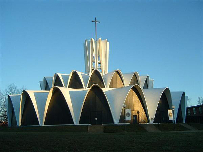
This stunningly serene place was also designed by Gyo Obata and likewise completed in 1962. The beauty of this building speaks for itself. Another poured concrete structure, it is as gorgeous inside as out. If it defies your expectation for ecclesiastical architecture, I hope it earns admiration for its simple elegance. It’s one of my favorite buildings in St. Louis.
Lambert International Airport Terminal
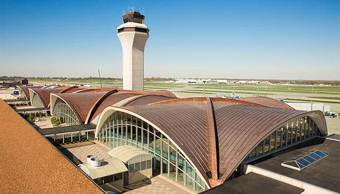
Before JFK, before Dulles International, before LAX, there was this: the St. Louis Lambert Airport Terminal. Opened in 1956, it was designed by Minoru Yamasaki, who later gave us the original World Trade Center. You might be noticing a theme involving sweeping curves and arches. I don’t know if that is unique to St. Louis, but arches are important to us.
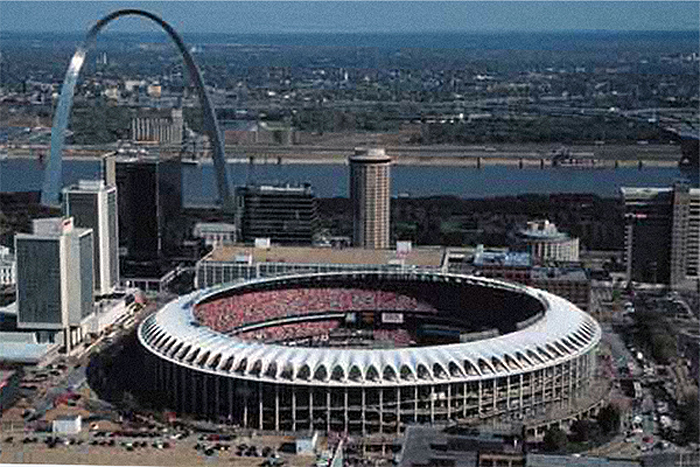
Busch Memorial Stadium
Yet another poured concrete structure, Busch Memorial Stadium opened in 1966. It was mostly designed by Sverdrup-Parcel, but the top crown of arches were designed by Edward Durell Stone of Chicago, the same architectural firm that gave us my community college at Forest Park.
In addition to white painted poured concrete, curves and arches, there was a penchant for round buildings during the space-age. Note the cylindrical hotel behind the stadium. It’s 30 floors were topped with one of those highly desired 1960’s destinations: a revolving restaurant. And of course, there is the Gateway Arch, the design inspiration for the row of arches atop the stadium.
This stadium is no longer with us. This was the second Busch stadium, which replaced an older “jewel box” style stadium in midtown St. Louis. This same downtown site shown above is occupied by the third, and current, Busch Stadium, flanking the new Ballpark Village, a multi sports bar extravaganza that feeds and waters (figuratively speaking) Cardinal Nation.
The third Busch is acceptable, if cliche, early 21st century retro, striving, with adequate success, to harken back to old time baseball (if not old time ticket prices).
The third Busch is fine and does offer an intimate baseball experience, but I miss the mid-century coolness of Busch 2. After all, The Beatles played there. But Sir Paul is coming to Busch 3 in a few weeks, so yeah, yeah, yeah, we love the new stadium too.
The Gateway Arch
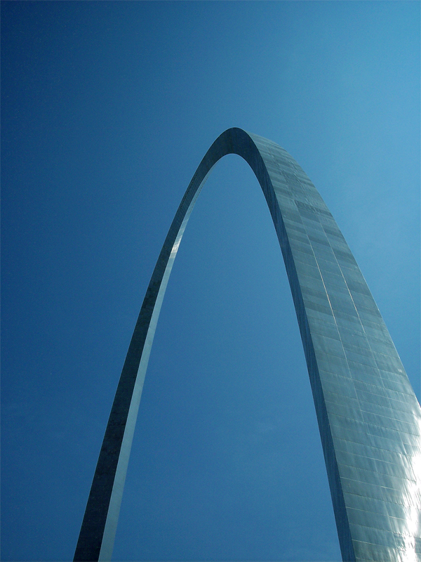
Here it is, our reigning king of mid-century modern. This inverted catenary curve made of stainless steel rises 630 feet above the Mississippi River and downtown St. Louis, making it the United State’s tallest national monument. Commemorating the nation’s westward expansion, following Jefferson’s purchase of the Louisiana Territory, it belongs to you as much as to us. It is actually part of your national park system, setting atop the National Jefferson Expansion Memorial Park.
Completed in 1965, with the ascending trams completed in 1967, it was designed in 1948 by renowned architect Eero Saarinen. Sadly he died before its completion, but we are grateful to him for giving us this most gorgeous symbol of our city. Yes, it does belong to you and the entire nation, but as a local symbol we recruit it for about every purpose imaginable.
Good Stuff
There is a tendency for some to hold modern architecture in contempt. I’m not intending to be your personal taste-maker if you are one of those. I’ll only say I don’t fully understand the rush to judgment. I understand it a little, I guess. The sparse, unadorned architecture of the mid twentieth century looks inhuman and cold to some. The “good stuff”, like the Arch and Planetarium, is mingled with cheaply built kitschy knock-offs.
For some of you, lack of ornamentation might suggest a minimalist utilitarianism devoid of art and beauty.
I look at the good stuff (I too dislike the bad imitations) not as inhuman deprivation, but simple elegance. They are quiet and don’t need to pronounce their presence with a lot of excessive makeup. I compare their elegance to the neat and clean lines of men’s suits in the early 1960’s. Contrast the Brooks Brothers wardrobe worn by JFK with the triple-knit, deranged patterned, polyester fashion wrecks filling our closets a dozen years later.
I don’t mean to say I lack admiration for great architecture from previous eras. I do like Beaux Art, Classical, Greek Revival, and Gothic. Good is good, wherever and whenever it exists.
Those eras, however, also had their excessive moments and cheap knockoffs. Their creators had their ulterior motives too, fueled by personal, corporate, ecclesiastical, and civic egos.
As with older, more ornate architecture, there is no one-size judgment that fits all. There is bad old stuff, there’s bad new stuff. Suffice to say there is great old stuff, and I argue, great new stuff. It doesn’t have to be either/or.
When I stand under the sweeping Gateway Arch, stroll down the gentle hill alongside the Planetarium, or prepare to soar into the sky via Lambert Airport, I’m filled with the same awe and wonder as when I enter a Gothic cathedral or an Art Deco New York skyscraper.
I don’t feel I have to pit one against the other anymore than I have to make a moral choice between shades of skin color, flavors of ice cream, or makes of automobile. I don’t begrudge the era in which I was born, and I enjoy the freedom to enjoy its unique architectural contribution to the story of human flourishing. If I find that my love for the architectural style of the Gateway Arch was (surprisingly) immoral, then I hope I receive the grace to repent. I’ll be honest to say I would be very surprised to find its design morally deficient.
On the contrary I think it reflects a quiet dignity, joined with majestic scale and breathtaking beauty. If you have never stood beneath the Arch and gazed skyward, I hope you someday get the opportunity. I hope you find yourself pondering what compels a human to imagine, design, and build, such beautiful things.
Forest Park Community College photo ©blogs.missouristate.edu
Planetarium photo ©2014 Ed Koehler
Gateway Arch photo ©2015 Ed Koehler
Lambert Airport Terminal photo ©ACI-NA
St. Anselm Priory photo ©waymarking.com
Busch Memorial Stadium photo ©St. Louis Chapter BBWAA

Thanks for this pictorial review of some of my favorite sights in St. Louis. Not a bad place to live.